
LOVE KITSAP
MAIN BRAND
Along with the classic white + black colors - the colors below add a complimentary vibe to this Kitsap lifestyle brand.


SUMMER BRAND


FONTS
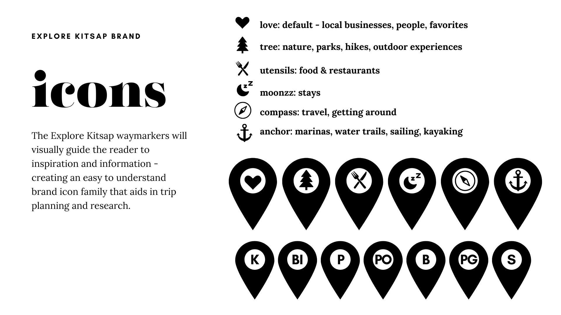
ICONS
The Explore Kitsap way markers will visually guide the reader to inspiration and information - creating an easy to understand brand icon family that aids in trip planning and research.
BRAND VALUES:
EXPLORATION: equip & inspire others to explore & encourage adventure
AUTHENTICITY: real people, real connection, real voice
DIRECT EXPERIENCE: taste, touch, hear, see and feel for yourself
COMMUNITY: our communities are our greatest asset
APPRECIATION: encourage & appreciate culture, people & the natural world
BEAUTY: esteem and communicate all that is beautiful in Kitsap
THEMES:
Strong + Bold
Simple graphics
Strong/bold fonts
Adventurous
Not feminine/neutral
Doesn’t alienate any person or group
Attractive to all people groups
HIGHLY VISUAL
MINIMALIST + VISUAL:
Icon Focused, use graphics and images to tell most of the stories
Stories are highly visual with interesting and entertaining content
LOVE FOR KITSAP:
Content is positive, uplifting, encouraging, beautiful, helpful and inspiring.
We rise above conflict and drama to spread joy.
HERO ATTRIBUTES:
They don’t KNOW how much they will love Kitsap!
- Aspirational
- Experience Driven
- FOODIES
-Millennials who are ‘over’ Seattle
- Professionals
THE BRAND GIFT:
Genuine knowledge, love and reliable information on Kitsap County. A unique, authentic inspired lifestyle perspective from locals who love and live in Kitsap.